Olio Carli
ECOMMERCE - UI Design - 2021
✺
From Shelf to Screen
Reimagining the Fratelli Carli E-commerce experience
PROJECT GOAL
Fratelli Carli, a leading producer of Ligurian EVO oil since 1911, boasts a rich heritage and a strong physical brand identity evident in its product packaging and in-store experience (emporiums). However, a disconnect existed between this established brand persona and its digital presence, encompassing social media and the e-commerce website.
This project aimed to bridge this gap by undertaking a comprehensive restyling of the e-commerce website. The objective was to achieve visual and stylistic alignment with the existing physical brand identity, while preserving the established content structure and strategic foundation of the website. In essence, the project focused on streamlining the visual language and layout styles, ensuring a cohesive brand experience that seamlessly reflects the established identity of Fratelli Carli's packaging and emporiums.
01
Research
1. Desk Research
2. UI Audit
3. Competitor analysis
4. Stakeholders interview
02
Define
1. Site analysis and mapping
2. Look & feel
03
Ideate
1. Typography
2. Color Palette
3. Icons
4. Definition boards
5. Prototype
01 . 2 - UI AUDIT
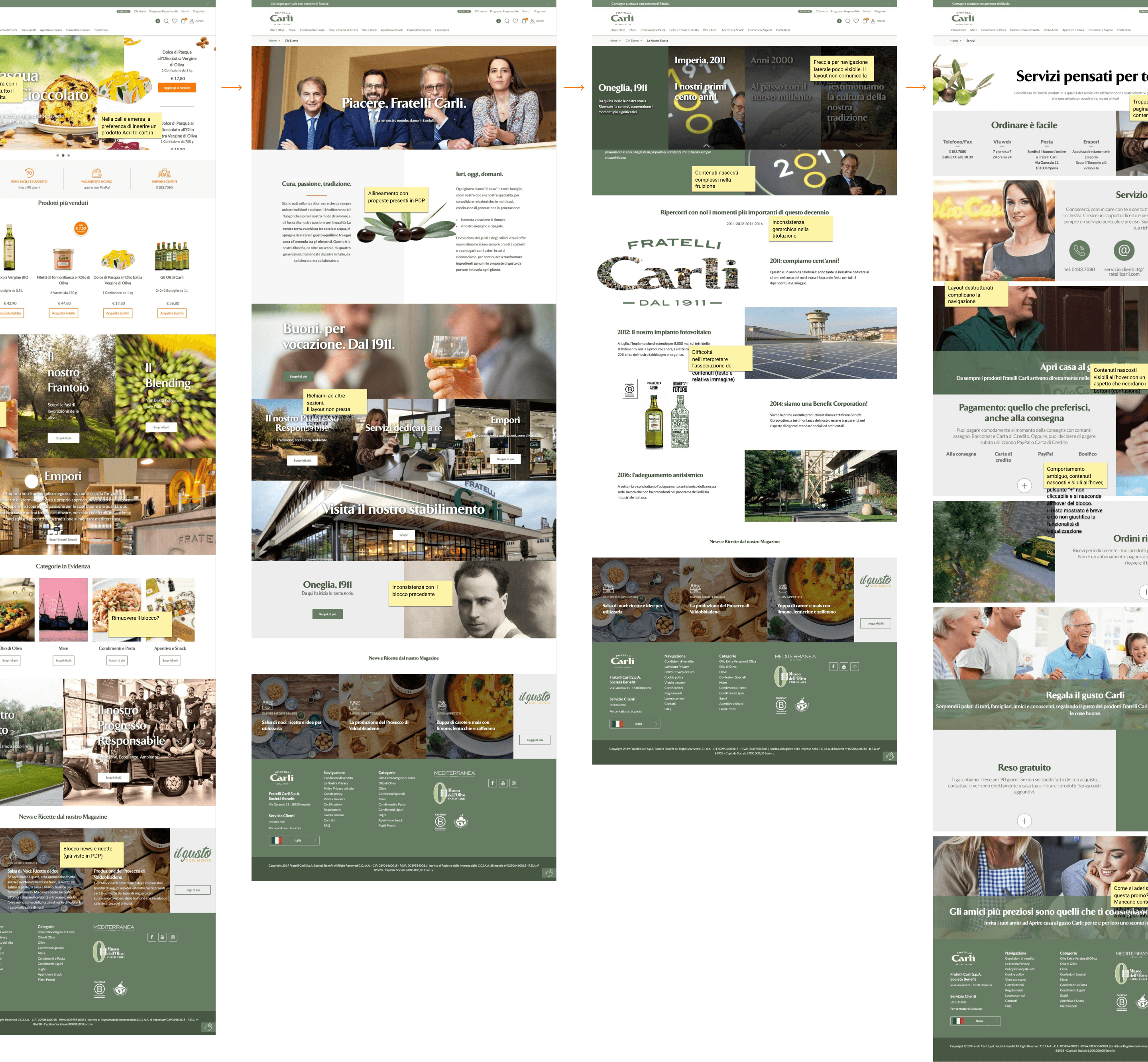
Identifying areas for improvement with a site audit
A comprehensive analysis and mapping of the e-commerce website revealed several key areas for improvement.
Layout Challenges: Inconsistent layout structures presented a significant challenge. Content elements, often not designed for the specific layouts, were frequently forced into these structures, leading to display issues across various screen sizes (breakpoints).
Accessibility Concerns: Another recurring issue involved the use of low-contrast text on photographic backgrounds. This compromised readability and accessibility for some users.
02 . 2 - LOOK & FEEL
A new approach to design
Recognizing the website's needs, we opted for a novel approach to the redesign process. We strategically shifted away from a traditional wireframing workflow and instead embarked on a comprehensive module mapping exercise. This involved meticulously grouping and categorizing all website modules by content type and functionality.
The primary objective of this exercise was twofold:
Identifying Holistic Requirements: By systematically mapping all website modules, we gained a deeper understanding of the overall user experience and its underlying needs.
Unveiling Design Consistency: This process allowed us to identify seemingly disparate elements that, in fact, shared similar stylistic and communication requirements.
By addressing the issue of design heterogeneity, we paved the way for a more cohesive and user-friendly website experience. Consistent page structures and visual elements would ultimately enhance usability and navigation.

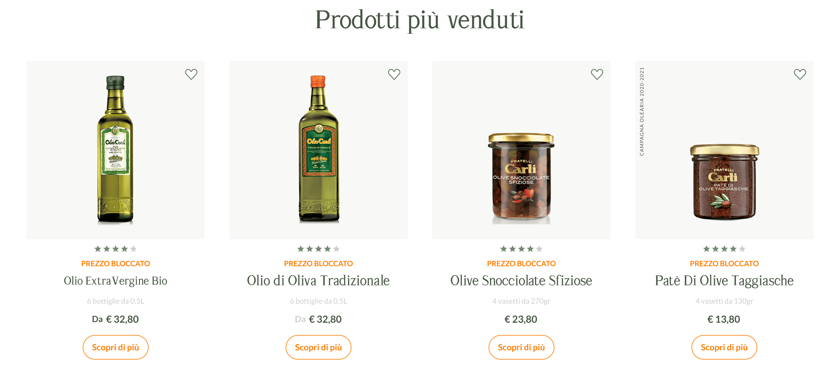
03 - IDEATE
Refreshing the new digital identity
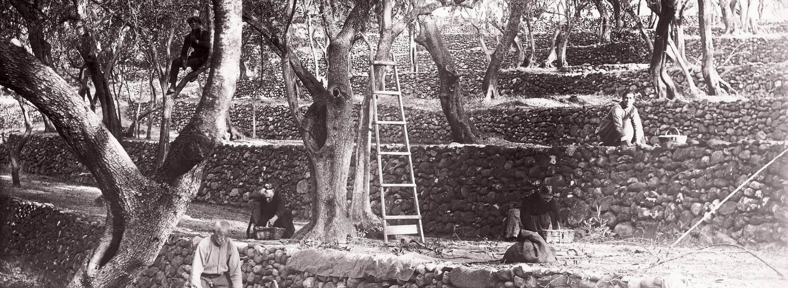
The project benefitted immensely from the privilege of accessing Fratelli Carli's extensive archive. This treasure trove encompassed a rich collection of historical materials, including photographs and advertising campaigns spanning from the 1930s to the present day.
This invaluable resource proved instrumental in our exploration of the brand's core identity and its evolution over time. By meticulously studying these archival elements, we were able to identify the enduring visual and messaging elements that have consistently shaped consumer recognition of the Fratelli Carli brand. Furthermore, this exploration informed the development of innovative digital applications, allowing us to leverage and effectively scale these brand signatures across various digital touchpoints.
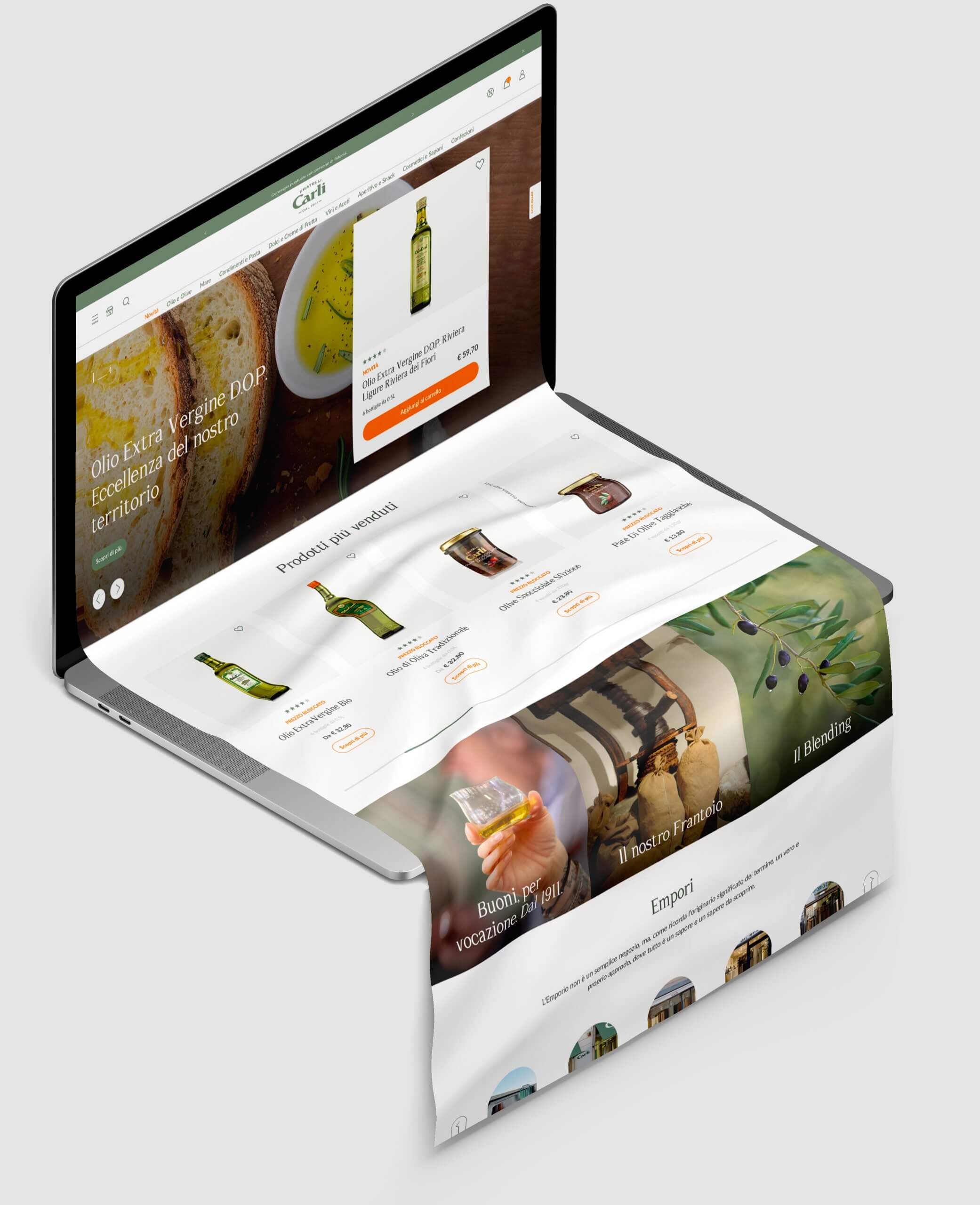
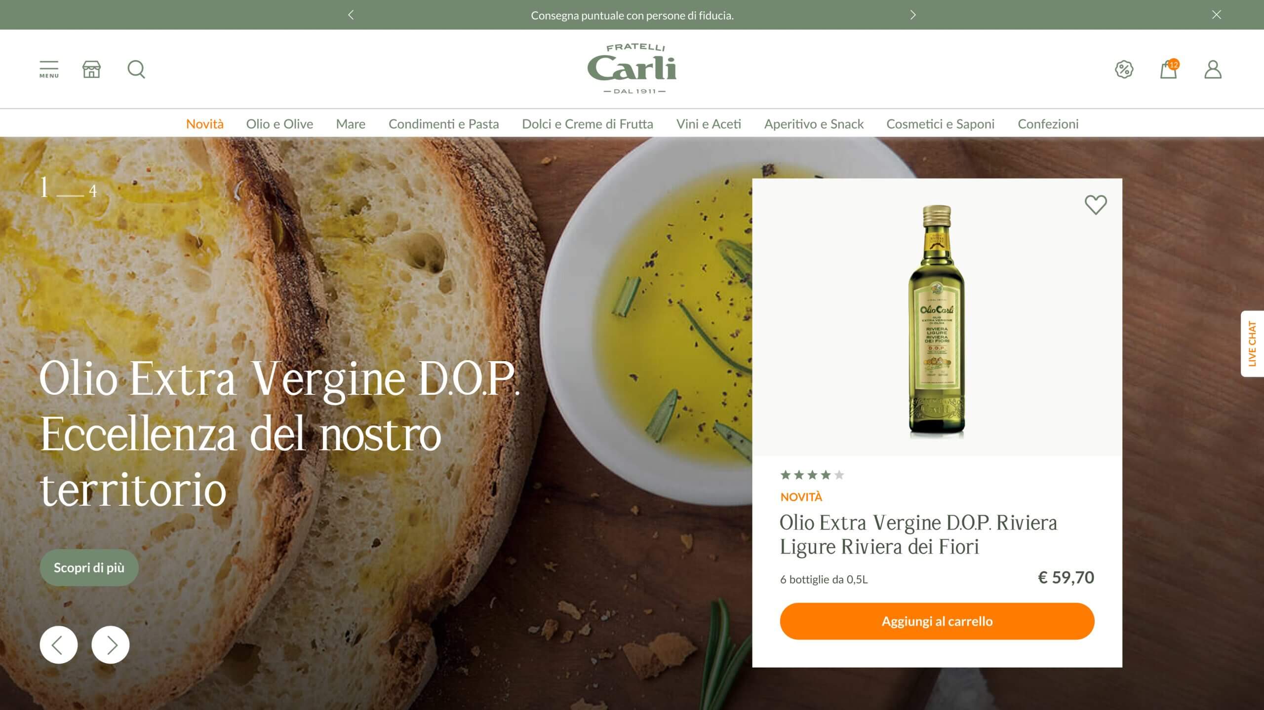
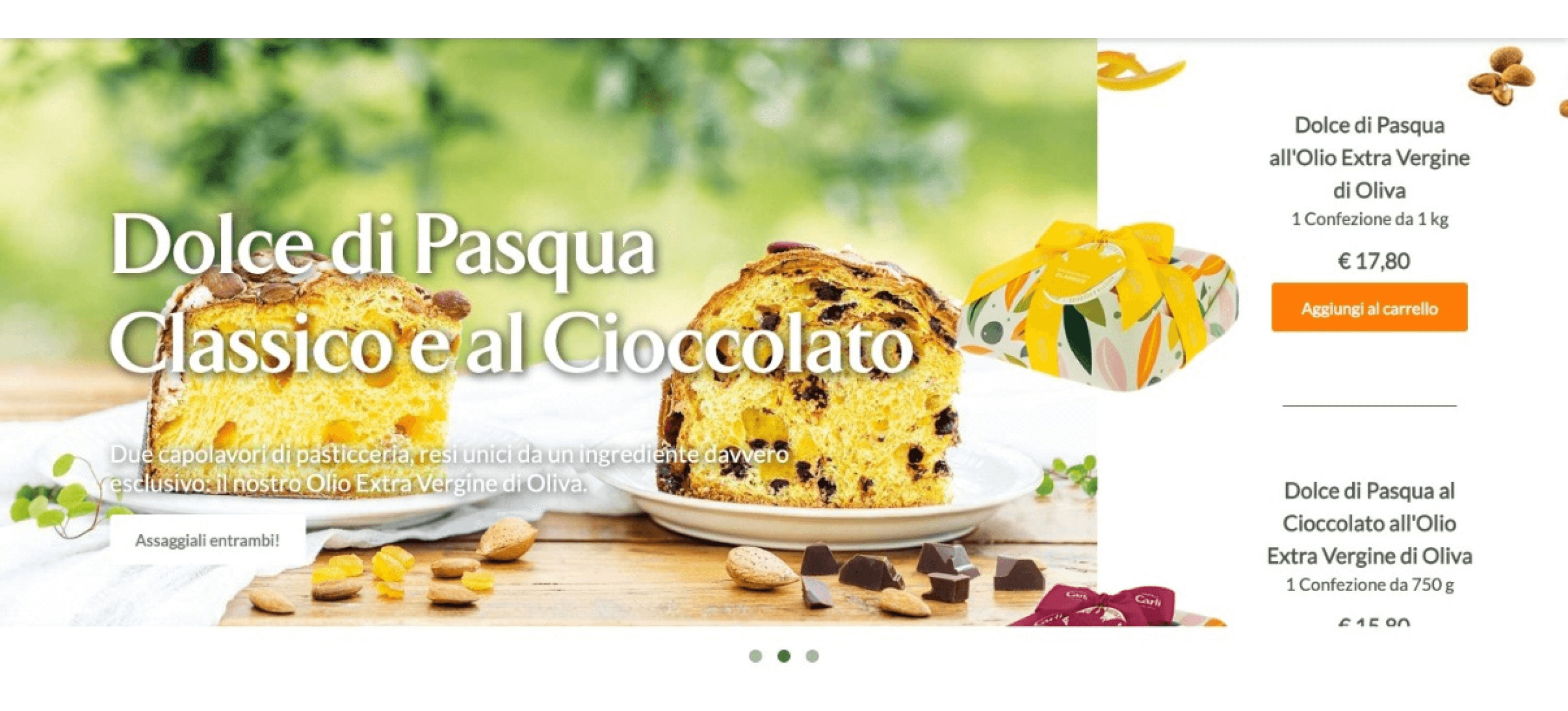
BIGHERO IN HOMEPAGE
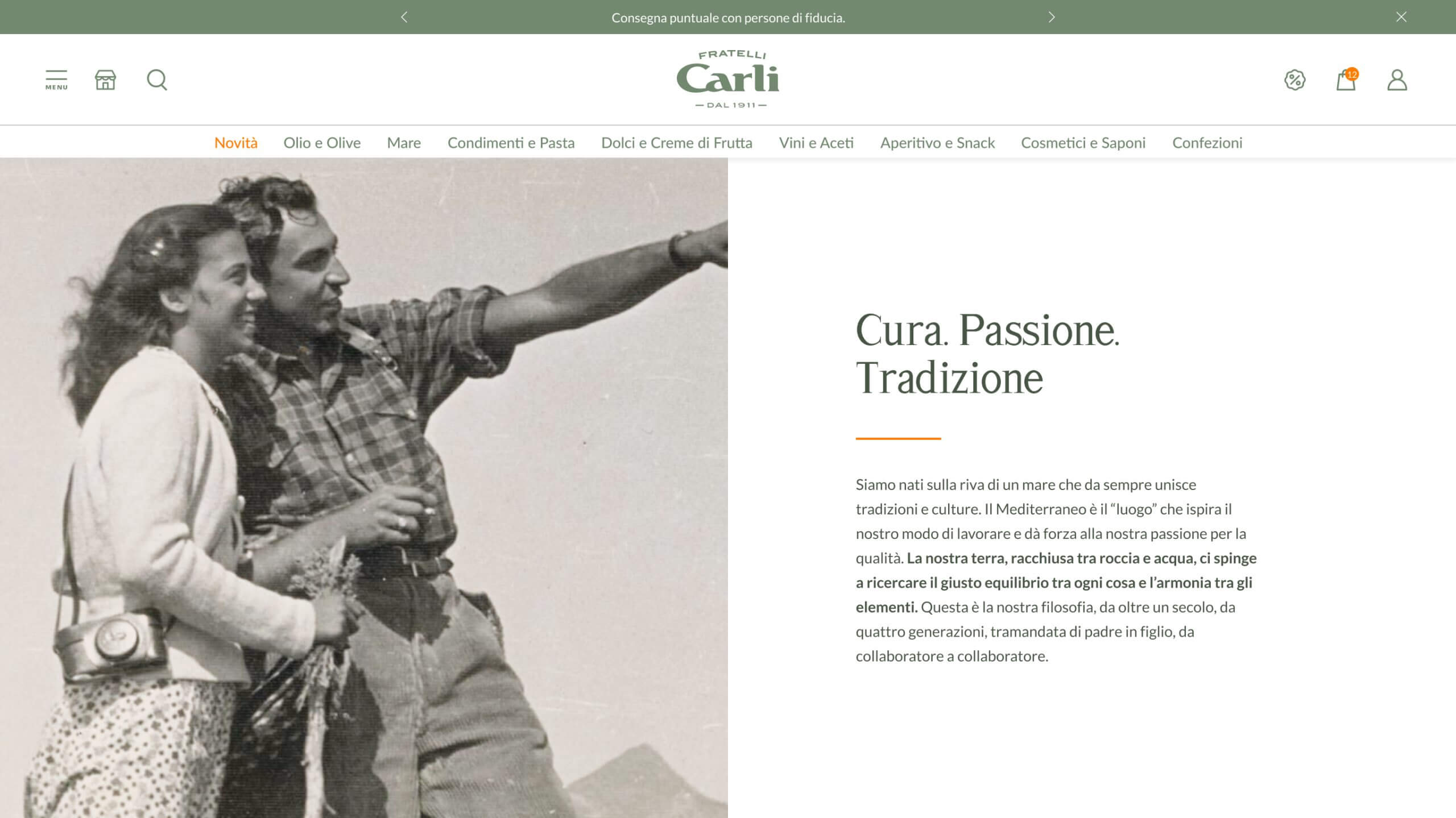
EDITORIAL PAGE
03 . 4 - DECLINAZIONE TAVOLE
Optimizing menu navigation
To optimize the user experience, we proposed a strategic revision of the website's navigation based on information architecture principles. Our primary focus was on ensuring immediate accessibility for core user goals – browsing and purchasing shop items.
To achieve this, we recommended concealing the various editorial and historical content sections within a hamburger menu. This approach established two distinct navigation channels:
Primary Navigation: Focused on facilitating easy access to shop items, promoting a clear and direct path to purchase.
Secondary Navigation: Accessible through the hamburger menu, housing non-essential yet valuable content such as editorial articles and brand history sections.
By implementing this two-tiered navigation system, we aimed to create a cleaner and more streamlined user experience, prioritizing the user's primary goal of product discovery and purchase.
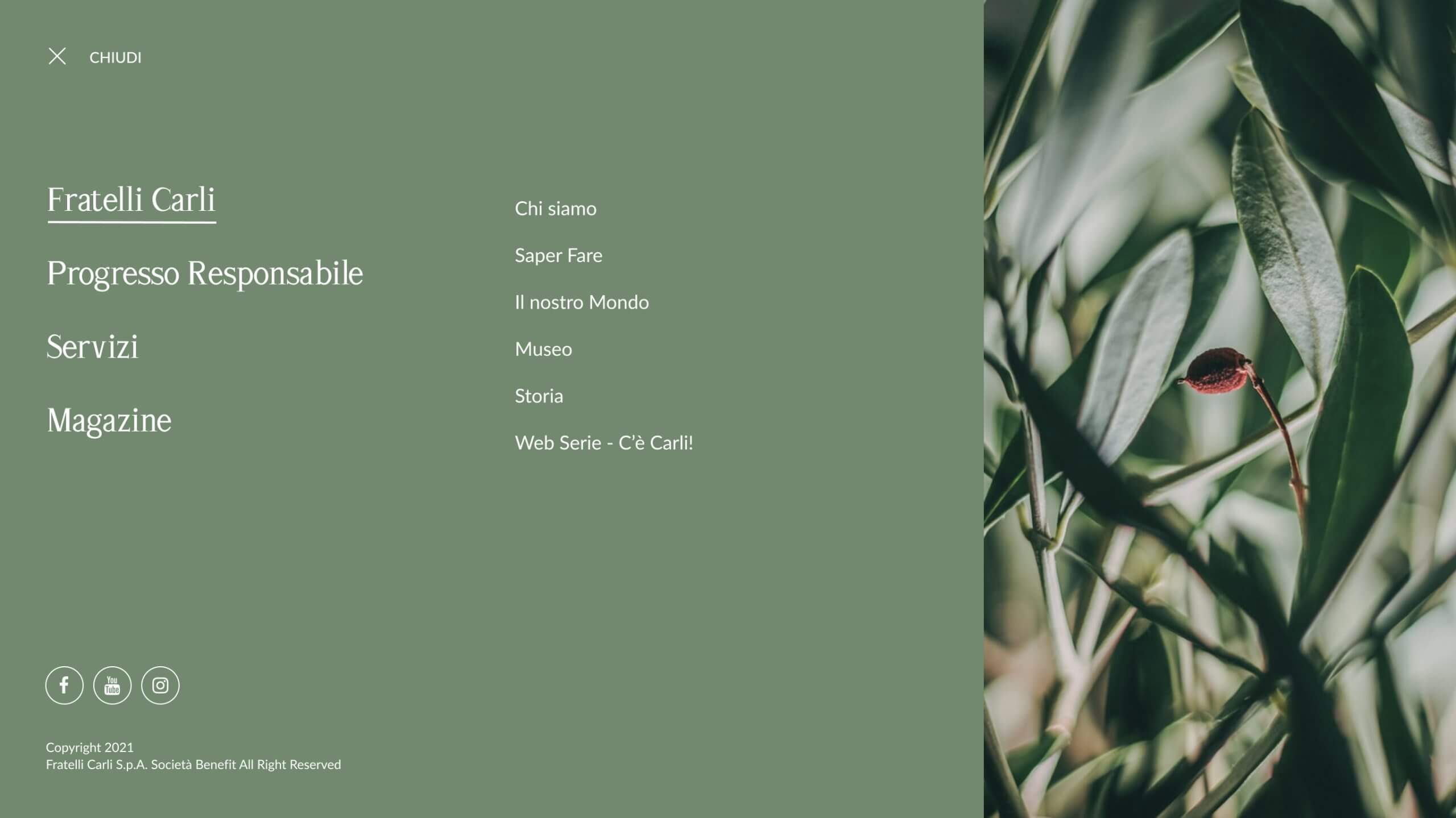
HAMBURGER NAV
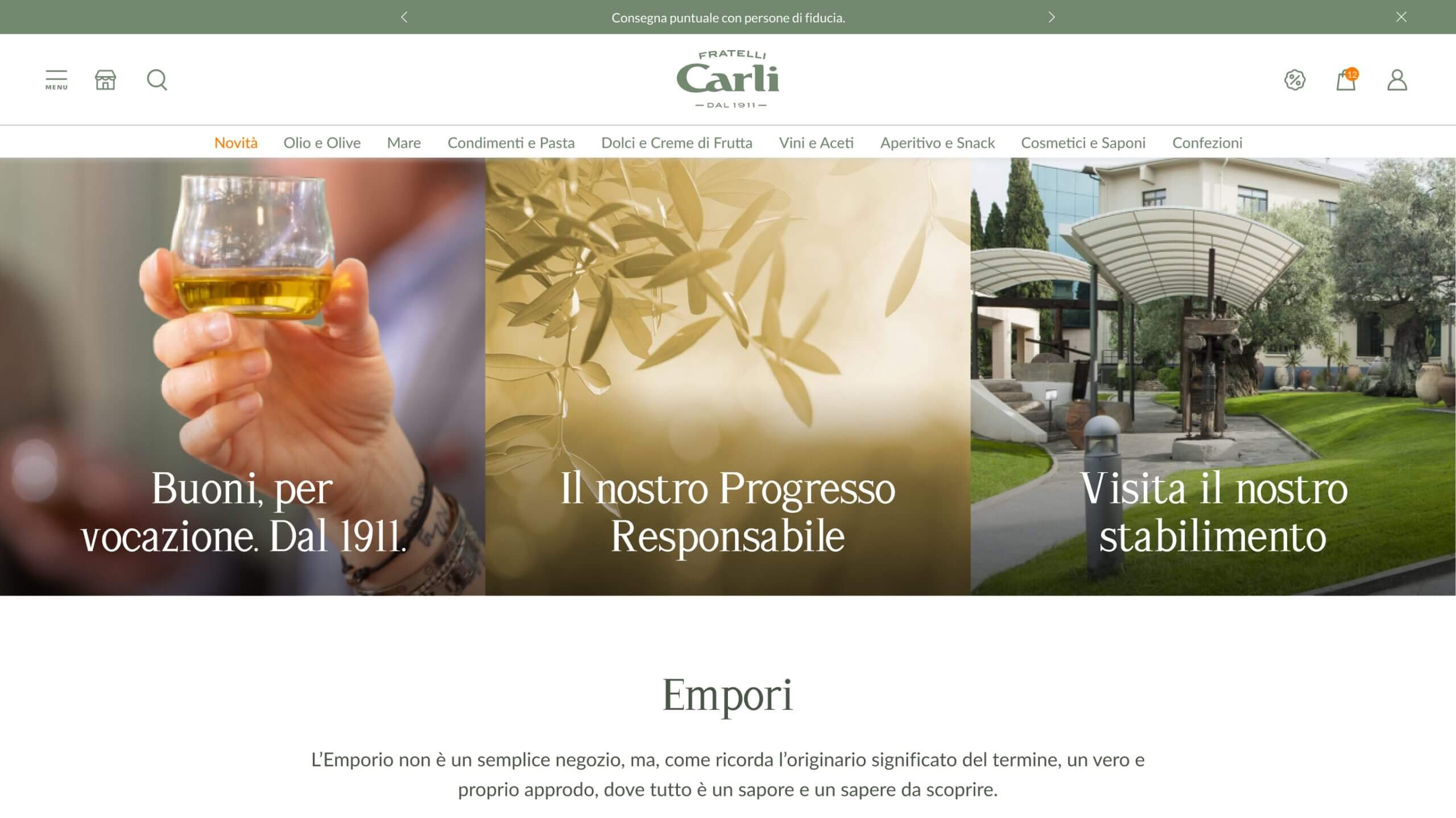
HOMEPAGE EDITORIAL
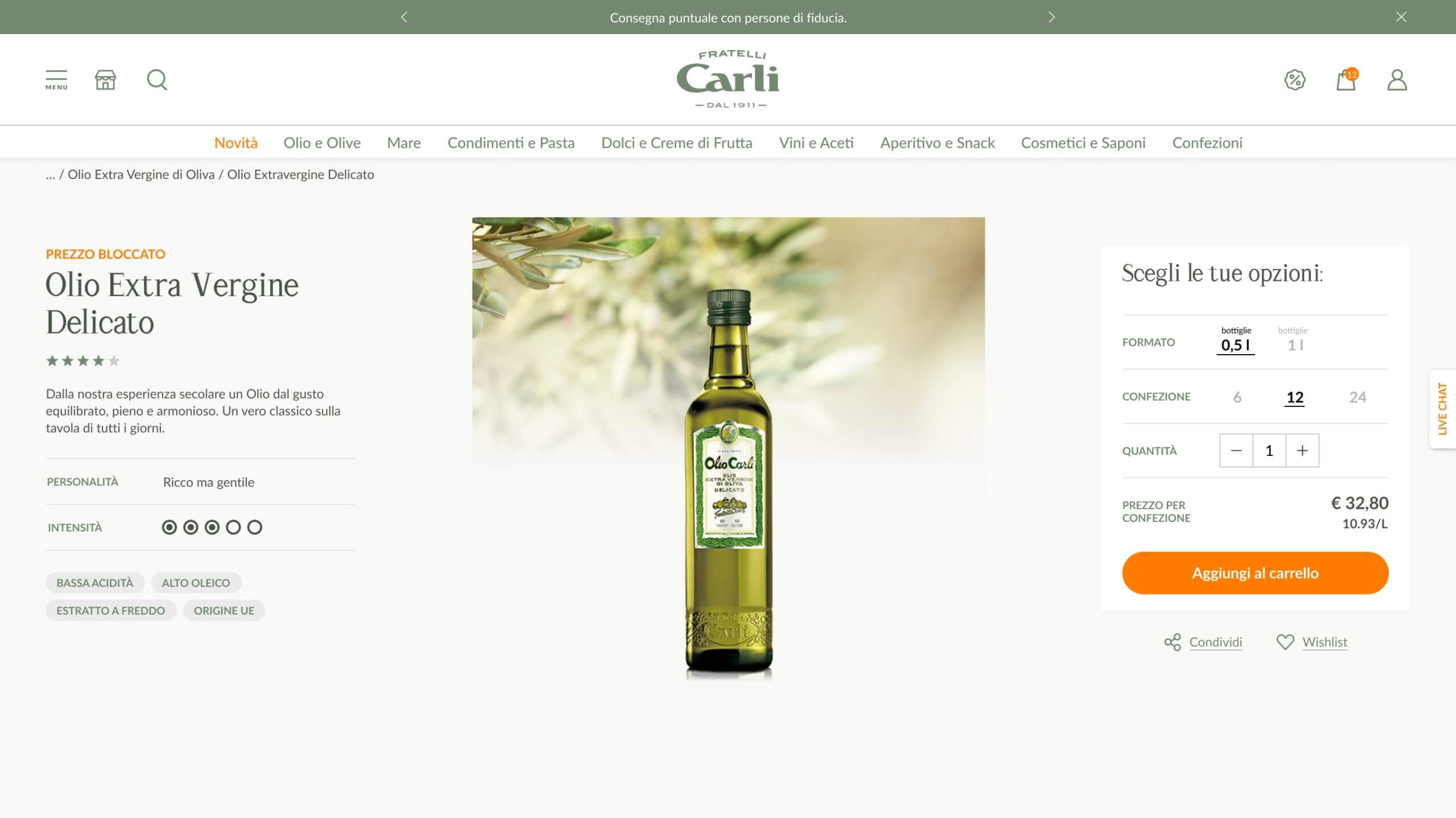
PRODUCT PAGE VIEWPORT
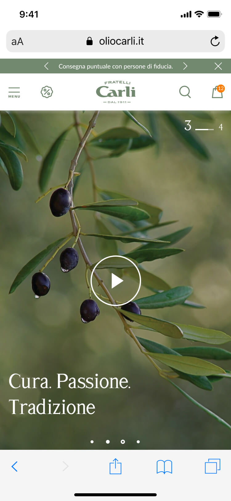
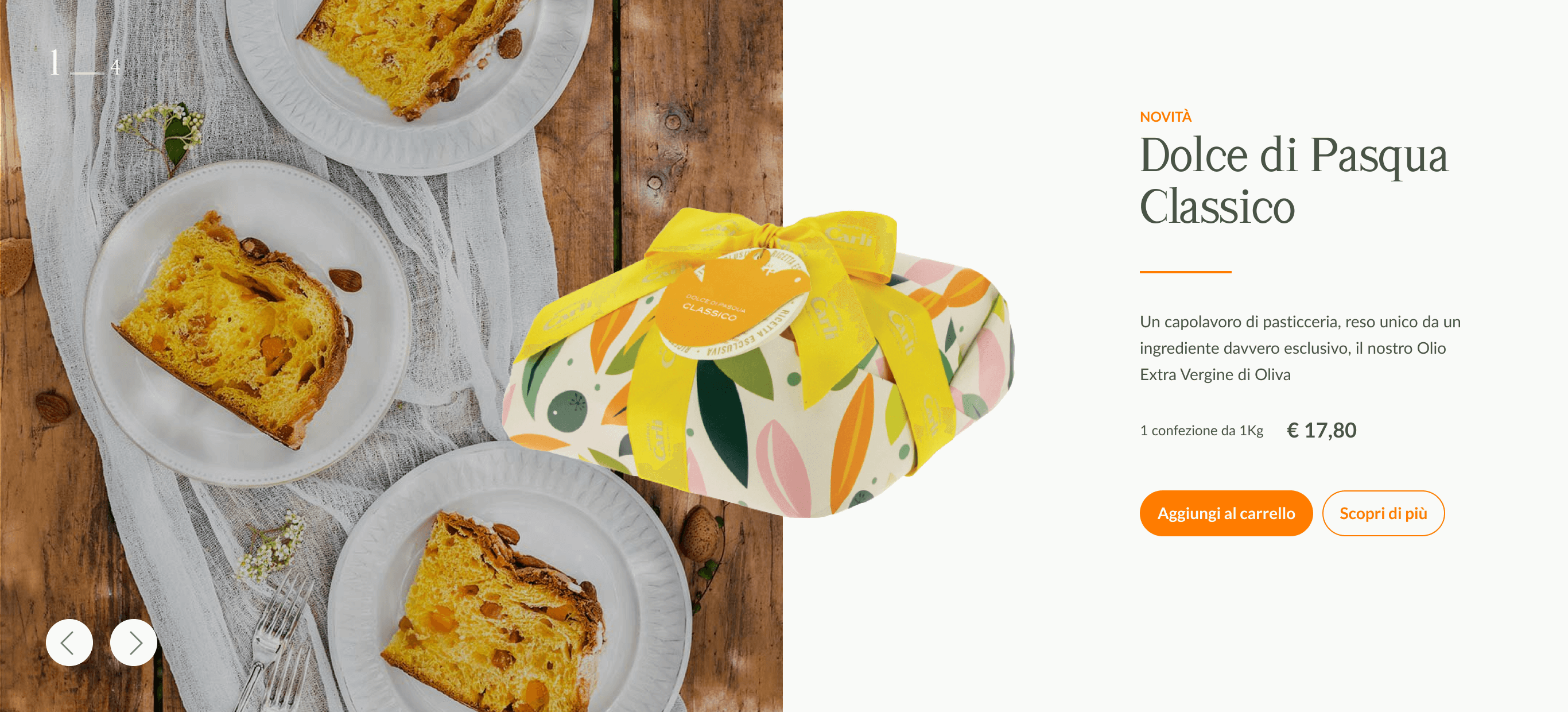
BIGHERO HOMEPAGE
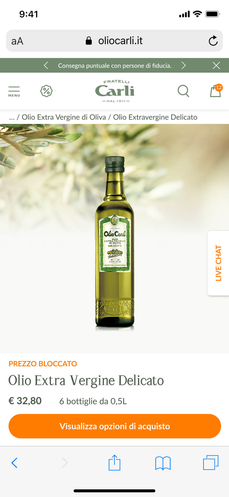
PRODUCT PAGE
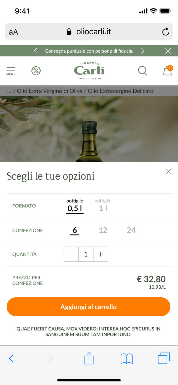
STICKY ADD TO CART
🙌